Forum rules
Please note that the extended image rules for the Gallery forum also apply here.Post Processing - Practice with a Sample Image
Thu 02 Oct, 2014 7:26 pm
The best free resource for beginners and intermediates is in my opinion Cambridge in Color. A large amount of the terms and concepts of PP are explained there.
http://www.cambridgeincolour.com/photo- ... orials.htm
Critique of the content and motif don't belong here.
Feel free to post your own DNG (Digital Negative; the universal raw image file; the equivalent of a film negative)
As suggested by GPSG here: viewtopic.php?p=244145#p244145
Re: Post Processing - Practice with a Sample Image
Thu 02 Oct, 2014 7:31 pm
Thanks for following this up.
While it's not ideal, can we work with jpg files if that's all we have? I gave up shooting in both because i so rarely got to play with the images that took up so much space. If i'm doing a bit of tweaking, I save as a tif file (or xcf - maybe GIMP-specific?) before I start to avoid too much degradation.
Re: Post Processing - Practice with a Sample Image
Thu 02 Oct, 2014 7:32 pm

Re: Post Processing - Practice with a Sample Image
Thu 02 Oct, 2014 7:38 pm
Tortoise wrote:While it's not ideal, can we work with jpg files if that's all we have? I gave up shooting in both because i so rarely got to play with the images that took up so much space. If i'm doing a bit of tweaking, I save as a tif file (or xcf - maybe GIMP-specific?) before I start to avoid too much degradation.
You can work with jpg, but you will not be able to change much (if any) exposure, especially downwards. If you try you will have increased risk of posterization:
Posterisation is the banding in the darker and lighter areas. It is a direct result of the decreased dynamic range in jpg files.
The best resource on the topic is cambridge in color: http://www.cambridgeincolour.com/photo- ... orials.htm
Have a look at the sun and the bottom left to see banding/posterisation.

xcj is the GIMP equivalent of a PSD image. It has very little compression applied.
Re: Post Processing - Practice with a Sample Image
Thu 02 Oct, 2014 8:27 pm
I've been fairly happy with some tweakage without posterisation that I've been aware of. But are you saying that any file that began life in jpg format, no matter what I convert it to, will have the same problems as if I did all the changes in jpg? From a brief GIMP course, I gathered that it was a compromise that allowed more playing with better results.
Re: Post Processing - Practice with a Sample Image
Thu 02 Oct, 2014 9:33 pm
Icefest and others, do you want to set a minimum file spec for the upload? Or people can just do with what's given. Poor file = Less to talk about and moving onto the next image. Natural selection.
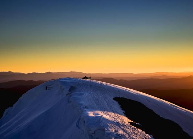
Icefest, on your photo, I have to say there's so little I want to touch but for a bit of crop, just maybe. The richness of colour is way nicer than what's displayed in the preview photo above. Did you deliberately "downgrade" the image for the preview?
Re: Post Processing - Practice with a Sample Image
Thu 02 Oct, 2014 9:41 pm
This is a good idea. Just a very quick and dirty attempt with your photo in Light Room before I go to bed:
Temp: 5500
Tint: +6
Exposure: 0.00
Contrast: +25 (to bring out the hills in the back ground)
Highlights: -20
Shadows: +40
Whites: +75
Blacks: -30
Clarity: 0
Vibrance: +20
Saturation: 0
I also reduced the blue saturation by -25 to remove the blue tint to the snow and I sharpened it slightly.
Anyhow, that is my go. I will be interested to see what others can do with this.
Cheers
Andrew
EDIT: mmm in hindsight think I need to reduce the shadows back towards 0
A little better
Anyway, bedtime!
Re: Post Processing - Practice with a Sample Image
Thu 02 Oct, 2014 9:48 pm
Comment: I just love and see the range of colour spectrum on display that's worth exaggerating. The deliberate split of the image into 50 up and 50 down accentuated the sky blue which is in contrast to the warm glow in the middle band and the blue hue over the snow below. A tighter crop gave it more focus to a simpler geometric pattern.
Add: Odd, the colour in the browser window isn't quite the same as when opened directly on the same Mac screen. Just a little less warm in the browser. And now I wonder how it's appearing on others' screen.
Re: Post Processing - Practice with a Sample Image
Fri 03 Oct, 2014 7:18 am
Anyway, this is what I did with the photo
Larger: http://puu.sh/bWKYv/5f70618108.jpg

Settings:
http://puu.sh/bWOtN/a3f37befd1.png
http://puu.sh/bWOuU/1be8b21e65.png
http://puu.sh/bWOuU/1be8b21e65.png
http://puu.sh/bWOwJ/2a115de820.png
Re: Post Processing - Practice with a Sample Image
Fri 03 Oct, 2014 7:52 am
EDIT, Icefest nice PP by the way even if it is a touch sharp for my liking but I'm just a general observer, I know very little about the topic.
EDIT AGAIN, I take that back. It softens enough over to the right to lose the fake effect on the left of the background.
Re: Post Processing - Practice with a Sample Image
Fri 03 Oct, 2014 9:35 am
With this photo I personally preferred to keep it lighter, allowing for more detail in the shadows, and to get the grass on the right to glow a little in the sun. However, I think that GPSG and icefest's darker images are much more "moody", for want of a better term. The darker images are not so much to my liking, however my partner preferred the look of those two images. It will be interesting to see what others think and what they can come up with.
btw, I played around with some black and white and cropping too and came up with this as my favourite
Re: Post Processing - Practice with a Sample Image
Fri 03 Oct, 2014 9:55 am
So other than my radical crop I've sharpened it added clarity and contrast, vibrance, crushed highlights, boosted shadows and that's about it!! My other treatment of the scene would be similar to icefests.
Just my take on it of course
- Attachments
-
Re: Post Processing - Practice with a Sample Image
Fri 03 Oct, 2014 10:20 am
Re: Post Processing - Practice with a Sample Image
Fri 03 Oct, 2014 10:43 am
GPSGuided wrote:Naughty Pteropus for playing the B&W card! Always a winner with landscape scenes.
Yep, that's nice Pteropus. You win
Re: Post Processing - Practice with a Sample Image
Fri 03 Oct, 2014 10:58 am
Re: Post Processing - Practice with a Sample Image
Fri 03 Oct, 2014 12:42 pm
stepbystep wrote:Yep, that's nice Pteropus. You win
lol i didn't know it was a competition! haha
anyway, I'm not really happy with the grassy area being so dark showing no detail. It just looks like a black blob in my b&w version. I'd probably try to lighten that area if I was doing it again.
Re: Post Processing - Practice with a Sample Image
Fri 03 Oct, 2014 2:35 pm
Re: Post Processing - Practice with a Sample Image
Fri 03 Oct, 2014 5:37 pm
Pteropus wrote:Hi icefest. What version of Lightroom are you using? I applied your settings in Lightroom 5.6 but it did not reproduce the same colours. I'm not sure if this is because of differences between versions?
Lightroom 5.5, re-looking at it now though, there seems to be a graduated filter on the sky.
I think what Pteropus said sounds very true, I like a dark image.
Re: Post Processing - Practice with a Sample Image
Sat 11 Oct, 2014 4:32 pm
What color profile are you processing in LR and what colorspace are you exporting the file as?
Re: Post Processing - Practice with a Sample Image
Sat 11 Oct, 2014 5:04 pm
When posting images to the forum I usually just use a screenshot program like puu.sh that uploads automatically to the web. I'm not sure about the color space that's used for screenshots.
I'm too lazy to do a proper export and upload.
When I export , it's to sRGB.
Re: Post Processing - Practice with a Sample Image
Wed 22 Oct, 2014 9:45 am
Re: Post Processing - Practice with a Sample Image
Wed 11 Feb, 2015 6:06 pm
I wasn't too happy with the final result of this image but another member saw it's potential.
http://puu.sh/fLBN7/22c641661c.dng
Raw vs my PP:

Re: Post Processing - Practice with a Sample Image
Fri 13 Feb, 2015 5:22 pm
icefest wrote:Continuing this experiment:
I wasn't too happy with the final result of this image but another member saw it's potential.
http://puu.sh/fLBN7/22c641661c.dng
I couldn't help but have a go at your image icefest.
First, in lightroom I took all sliders back to the centre, and then played around with them till I was happy with the image.
Temp: 5850
Tint: +9
Exposure: 0
Contrast: +10
Highlights: -70
Shadows: +50
Whites: +20
Blacks: -45
Clarity: +40
Vibrance:+30
Saturation: +10
Yellow: Saturation +40; Luminance +35 (brought out the greens in the eucalypts in the foreground)
Blue: Saturation +15; Luminance -45 (made the mountains in the distance more blue)
Sharpening Amount: 65
Noise Reduction: 15
Lens Correction Enabled
Re: Post Processing - Practice with a Sample Image
Fri 13 Feb, 2015 5:59 pm
Re: Post Processing - Practice with a Sample Image
Fri 13 Feb, 2015 11:42 pm
Re: Post Processing - Practice with a Sample Image
Sat 14 Feb, 2015 8:28 am
Re: Post Processing - Practice with a Sample Image
Sat 14 Feb, 2015 9:44 am
All done in LR5.7.1
Mainly gradients and brushes.
Nice looking area.
- Attachments
-
- DSC02280-resized.jpg (495.27 KiB) Viewed 41947 times
Re: Post Processing - Practice with a Sample Image
Sat 14 Feb, 2015 3:40 pm
Re: Post Processing - Practice with a Sample Image
Sat 14 Feb, 2015 5:38 pm
You had all the info there to start with, makes it easy
Not real happy with the colour on the middle range though, fix it another day perhaps
Cheers.
Re: Post Processing - Practice with a Sample Image
Sat 14 Feb, 2015 5:46 pm
© Bushwalk Australia and contributors 2007-2013.