A weather map depicts meteorological features such as wind, pressure and temperature in a particular place at a particular time. They can be used to show past and present data as well as predictions for future weather patterns. Some weather maps show a combination of various meteorological features to present a complete story.
Similar to map reading, weather maps convey detailed information through symbols and lines, as well as real-life satellite imagery. For Australia, the Bureau of Meteorology is a reliable starting point for finding weather maps.
While there are many ways to convey weather information on a weather map, we’ll run through a few of the most common below.
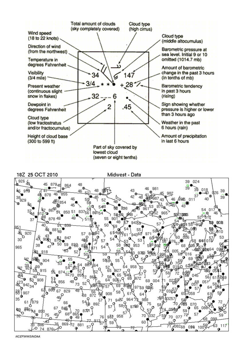
Across Australia, we have thousands of weather stations that collect detailed local data including everything from cloud type and cover right through to rainfall, pressure and wind also. When combined, local data from across the country can provide powerful insights into likely weather patterns in the future. To present the large amount of data in a meaningful way, meteorologists have developed a key to denote the weather at a particular location in shorthand.
Plotting multiple weather stations over a larger scale can be a helpful way to observe current weather patterns and predict future ones.
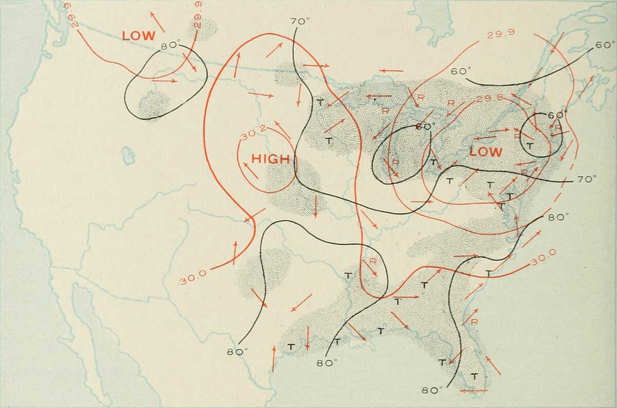
On generalised maps, barometric pressures recorded at individual weather stations are summarized into a contour map, where points of equal pressure are joined up with a line. These lines are known as isobars, and create a map with labelled contours so readers can view trends (see next map).
Pressure maps depict areas of high and low air pressure, which in turn, indicate likely weather conditions. They are generated from local weather station data reporting pressure readings.
In general, high-pressure systems mean stable air and good weather conditions. Conversely, low-pressure systems mean less stable air: clouds can form with subsequent rainy and stormy conditions.
Low or high air pressure systems are caused by the cooling and heating of air, and are dynamic, with continual 3-dimensional flow of air between the systems. That’s why air pressure and weather patterns can vary dramatically from day to day and between different areas.
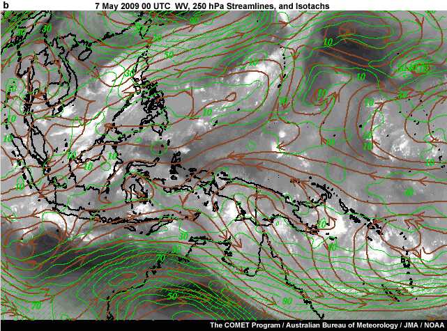
Streamline maps indicate wind patterns and are particularly helpful in tropical areas where pressure gradients are weak and are bad predictors of wind condition. They are based on pressure readings but transform the data into more useful images that show actual wind patterns. Streamlines are shown in brown on the image.
When we talk about ‘fronts’ in the context of weather, we mean a boundary separating two masses of air of different densities . These air masses are dynamic, moving, and are depicted on weather maps with symbols on the image.
Cold front
A cold front is at the leading edge of a temperature drop off, that is, a change from warmer weather to cooler weather. These cold fronts often bring rain, hail and heavy thunderstorms. They tend to produce much swifter changes in weather because they move up to twice as quickly as warm fronts. Cold fronts are associated with low-pressure areas. Once a cold front has passed, the air is cooler and drier than before.
Warm front
A warm front is at the leading edge of a warm air mass, and moves slower than a cold front. Fog often precedes a warm front, followed by clearing and warming afterwards. The air is warming and more humid in the wake of a warm front.
Occluded front
An occluded front occurs when a cold front overtakes a warm front. The two fronts curve around, resulting in a variety of weather patterns, thunderstorms possible, but usually just associated with drying of air.
Stationary front
A stationary front is a boundary between two air masses that is non-moving. In this case, neither air masses are strong enough to replace the other. A wide variety of weather patterns can occur, but most commonly, long periods of cloud and rain but restricted to a narrow band.