
Good Signage in National Parks Can Save Lives
Pascal Scherrer and Betty Weiler


Every time we hear of the tragic death of a visitor in one of Australia’s spectacular national parks, there is cause for reflection on how we communicate safety messages in nature.
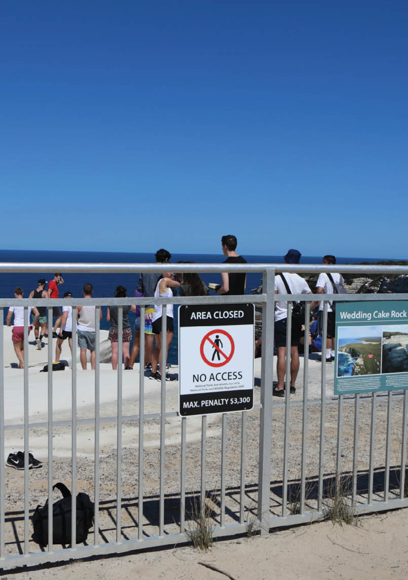
Tourists blatantly ignoring a warning signdavidmolloyphotography.com
52 | BWA August 2020


Our study, published in the Journal of Outdoor Recreation and Tourism, reviewed some of the signs in national parks in Queensland and Victoria; we also interviewed rangers and park managers.
Outdoor recreation inherently comes with risk but there are ways to reduce it without wrapping people up in cotton wool.
One of the simplest ways is to critically examine the way we design safety signs to ensure that visitors actually read them, connect with the message, and accept that this warning does really apply to them.
Our findings help to show why and how particular signs are effective at communicating safety messages – and what not to do.
To be effective a sign should, among other things:
be easy to notice
be easy to understand
use colours that stand out from the background
include languages other than English
include graphics and the traditional “no” symbol of a red circle with a line through it
avoid crowding too many messages into one spot.
Young men and international tourists at riskMillions of visitors access and enjoy Australia’s vast network of protected areas safely every year.
Park managers want locals and tourists to visit natural areas - it is good for health and well-being, the economy and society. Visitors to parks are also more likely to support national parks. Effective communication of safety information for visitors to national parks is essential, particularly where the potential consequences of mishaps are severe.
We know from previous research that certain groups, such as young men and international tourists, are particularly at risk - too often with tragic and sometimes expensive consequences.
Some park agencies are actively targeting high-risk groups at specific sites, as this example shows.
The focus is to tell the story of past tragedies to get across the message that the risk is real and relevant to them.
Warning sign, Kakadu National ParkPhil Whitehouse
“... young men and international tourists, are particularly at risk ...
BWA August 2020 | 53
Of course, risk is part of the attraction for some park-goers. But every visitor needs to know what is appropriate and inappropriate behaviour, and how to take responsibility for their own safety.
Thinking carefully about how we design signs to get safety messages across effectively is an important part of managing risk in national parks and natural areas generally.
Making signs noticeable and easy to comprehendBased on our analysis of research findings both within and outside park settings, we developed checklists to help park managers assess how effectively their signs communicate risk to national park visitors.
We tested these “best practice principles” checklists at several sites with two Australian national parks agencies. The process proved valuable in strengthening current safety sign policy and practice.
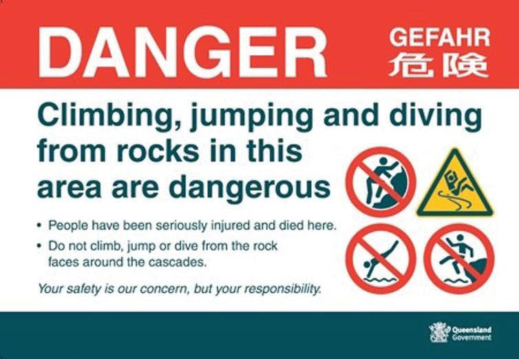
For example, the following sign meets the criteria for being “noticeable” and “easy to comprehend”.
Limit the number of messages per signPark authorities often need to communicate a lot of information at once to park goers. However, this can be done by using clever graphics and limiting the number of messages per sign. It’s also important to put warning signs close to the risky site, not simply warning people when they enter the park.
The example below shows how having multiple signs grouped together can make it hard for users to get the key messages, even if they are driving at low speed. It is all too easy to drive past and ignore the signs altogether.
Our study also highlights that good safety signs can support and complement the dedication and personal responsibility of frontline park staff. Serious incidents can have a direct effect on staff personally, and on the reputation of certain sites, particularly in the eyes of local emergency service workers.
Safety signage will be more effective if embedded in a coordinated risk-management system.

This is an exemplary sign. QPWS
54 | BWA August 2020
Pascal ScherrerSenior Lecturer, School of Business and Tourism, Southern Cross University
Betty WeilerProfessor, School of Business and Tourism, Southern Cross University

This article first appeared in The Conversation on 10 May 2018.
Activities in nature will always carry some risks and some people will choose to engage in unsafe activities despite knowing better. Accidents will continue to occur.
That said, our best practice principles for signage help park managers to do the best they can to make visitors fully aware of the risks while preserving the integrity of the natural site.
They also have direct applications to other nature-based visitor sites. Signs can help address issues such as the recent incidents with kangaroos at Morisset Hospital near Sydney, where visitors were feeding the animals carrots to get a close-up picture.
What we still need to knowWe have a poor understanding of what makes different types of people (such as those with different cultural backgrounds and experience levels, or people responding to peer pressure) misunderstand or ignore safety warnings.
Best practice signage is already in place at many high-risk park sites. As park visitation continues to increase and visitor profiles change, we need more research on what can help persuade at-risk visitors to read and act on safety messages.
It is time to invest in targeted research on this issue, including trialling and evaluating more innovative and persuasive communication techniques.

BWA August 2020 | 55